
A website design system is a set of reusable styles, components, patterns and templates, together with guidance on how to use them and how they work together. The UK Department for Work and Pensions defines it in these terms. For a UK business, e-commerce brand or charity, it is the structural layer that keeps every page consistent as the site grows, and it turns design decisions from one-off judgements into assets that compound.
This guide sets out what a design system contains, how it differs from a style guide, which UK examples are worth studying, and how to build and govern one without letting it decay.
The terms are often used interchangeably, and the confusion is costly. According to Nielsen Norman Group, a design system is the broad set of standards for design at scale, including reusable components and patterns. Style guides, component libraries and pattern libraries are parts of it. A style guide focuses on a specific area such as visual design, content or branding.
The practical distinction is this: a style guide describes, whereas a design system supplies. One engineering team puts it well, arguing that a design system is a toolkit enforced through reuse rather than a document to be read. Standardised components and tokens replace rules that people must remember and interpret.
That has a direct commercial consequence. A PDF of brand rules depends on every designer, developer and agency reading and applying it correctly. A system embeds the rules in the components themselves, so the correct choice is also the easiest one.
Nielsen Norman Group identifies two essential parts: a design-system repository and the people who manage it. The repository commonly contains three things:
Beyond these, a commonly cited list of elements adds design tokens, an icon library, accessibility guidelines and documentation. Design tokens deserve particular attention: they store values such as colour, spacing and type size once, so that a rebrand or a theme change propagates through the whole site from a single edit.
The second essential part, the people, is the one most often neglected. A system without an owner becomes a historical record of how the site used to look.
The DWP states plainly that design systems maintain a consistent user experience, and that reusable standards let teams design efficiently at scale, share best practice and reduce duplicated time and effort.
The cost of the alternative is visible in public-sector experience. NHS England Digital warns that without a shared, accessible system, organisations develop products in isolation, producing inconsistent experiences that undermine user trust. The commercial translation is straightforward:
Consistency also supports discoverability. Clean, repeatable templates make technical quality easier to sustain, a point we develop in our piece on how technical SEO quietly powers a better user experience.
Three public examples show different philosophies, and all are documented openly.
GOV.UK Design System. It provides styles, components and patterns so that government teams can build services consistent with GOV.UK. Its front-end package offers styles, JavaScript, HTML and Nunjucks implementations, which shows how seriously it treats code as part of the system rather than an afterthought.
NHS design system. The NHS is extending its existing system with components and patterns for staff-facing services, on the principle that one system is better than two because it supports consistency and reduces duplication and maintenance. Its service manual also asks that class names follow the BEM naming convention, which keeps code robust and easy to maintain.
BBC GEL. The BBC organises its system into foundations, components, layout components, theming levers and containers, and describes the aim as a single source of truth for design and implementation, reducing interpretation between teams.
The lesson for a commercial organisation is the structure, not the visual style: foundations first, components second, layouts third, with one agreed source of truth.
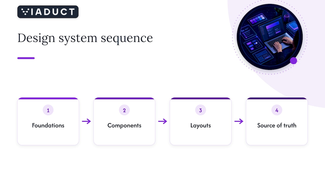
The sequence below follows the guidance from Nielsen Norman Group and the public-sector teams above.
Governance is a main element, not an add-on. Nielsen Norman Group notes that a design-system team needs continuous maintenance and oversight, and should at minimum combine interaction design, visual design and development, ideally with research, architecture and content expertise.
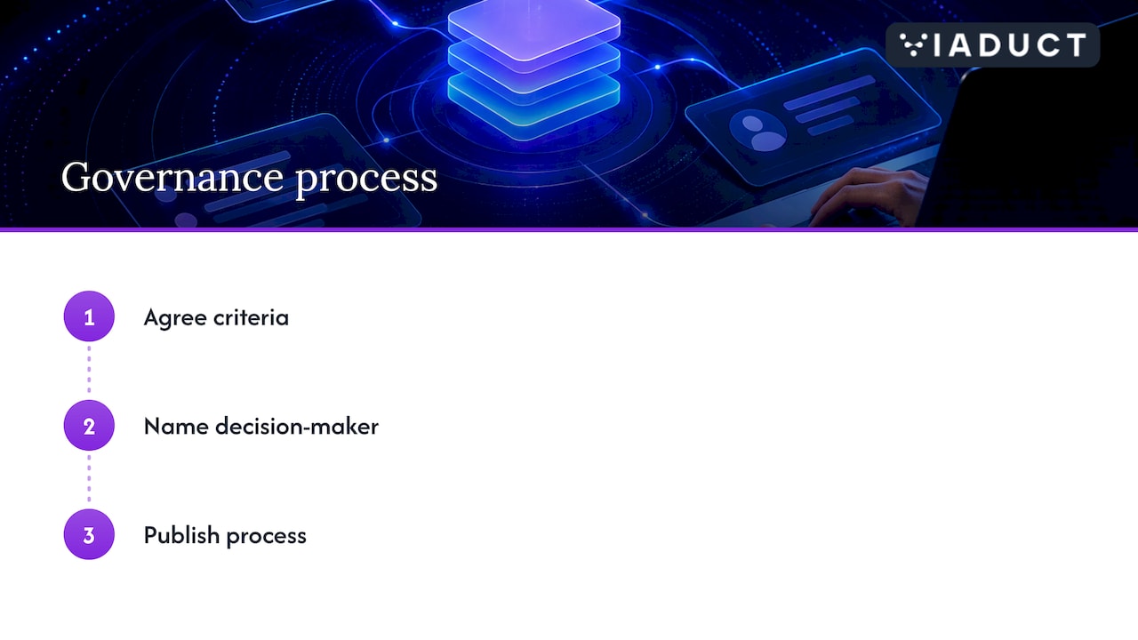
The GOV.UK approach offers a transferable model. It set up a cross-government working group, a multidisciplinary panel that reviews new components and patterns against set criteria before inclusion, while the core team supports contributors. The pilot involved representatives from several departments, including HMRC, the Home Office and DWP.
For a company, the equivalent is smaller but the logic holds: agree the criteria for adding a component, name who decides, and publish the process. The same GDS team identifies the central tension, which is balancing high standards against ease of contribution, while ensuring contributors have the time, confidence, motivation and permission to take part.
A design system is an operating asset, so it needs evidence. GOV.UK uses web analytics to identify issues in user journeys and areas for improvement. The commercial equivalent is to track conversion rate by template, form completion, page speed and the time taken to launch a new page.
Performance is the metric that most often drifts quietly as components accumulate, which we cover in Core Web Vitals drift. Teams building analytical skills for this work may find a web analytics expert course a practical route.
We treat a design system as one component of a wider acquisition engine, connecting brand, site, search and conversion. If you want a system built around measurable commercial targets rather than a visual refresh, our conversion rate optimisation service tests components against real behaviour, and our web development and design team can scope the build.
No. A style guide is one part of a design system and usually covers visual design, content or branding. A design system also includes reusable components, patterns and templates, plus guidance on using them together.
Not always a large one, but the principle scales down. A compact set of tokens, a handful of coded components and a named owner removes most duplication. Scale the system to the number of pages and people touching the site.
Nielsen Norman Group suggests deciding between adopting, adapting and creating according to your needs, budget and time. Adapting an open system is often faster, while a bespoke build suits distinctive brands with complex interfaces.
A small multidisciplinary team, with design and development as a minimum. Without a named owner and a clear contribution process, components multiply and consistency erodes.

