
Customer journey mapping is the practice of visualising every interaction a customer has with your organisation, from first awareness through to advocacy, capturing what they do, think, and feel at each stage. Done well, it shifts your team’s perspective from internal process to lived customer experience, and that shift is where the real commercial value lives.
Three reasons to prioritise it now:
The UK Government Communication Service uses journey mapping as a standard planning tool for public-sector campaigns, and B2B organisations increasingly treat it as a prerequisite before any CRM or digital investment. Your first step is simple: define the scope and objective before you draw a single box.
Customer journey mapping delivers commercial results when it is scoped to a clear objective, validated with real customer data, and governed as a living tool rather than a one-off project.
| Point | Details |
|---|---|
| Define objective first | A map without a specific decision to inform is too broad to act on; scope before detail. |
| Voting points drive retention | Focus improvement effort on the three to five moments where customers decide whether to continue. |
| Mix qual and quant research | Analytics show where friction occurs; customer interviews explain why it happens. |
| Governance keeps maps live | Assign stage owners, set a review cadence, and link the map to your product roadmap. |
| Viaductgen for sprinted delivery | Viaductgen’s 90-day AI-native engagements produce a validated map, prioritised roadmap, and measurable pilot. |
A customer journey map is a visual representation of the experience a customer has with your organisation, told from their perspective. It captures what they do, think, and feel, not what your internal systems do. Smaply draws this distinction clearly: a journey map is fundamentally different from an internal process diagram, which describes what your organisation does rather than what the customer experiences.
How it differs from related tools:
A sales funnel tracks aggregate conversion rates through defined pipeline stages. It tells you how many people moved from awareness to purchase; it does not tell you why someone hesitated at the proposal stage or what they felt when your onboarding email arrived three days late.
A process map documents internal workflows, handoffs, and system logic. Useful for operations, but the customer is absent from it entirely.
A service blueprint extends the journey map by adding backstage processes, support systems, and staff actions beneath the customer-facing layer. Think of it as a journey map with the engine room visible. It is the right tool when you are redesigning a service end-to-end, not just diagnosing a problem.
Scope decisions matter more than most teams realise. A high-level executive map covering five to seven stages is the right starting point for strategic alignment or a board presentation. A detailed operational map, drilling into every micro-touchpoint within a single stage, suits a product team fixing a specific friction point. The objective dictates fidelity and the stakeholder mix you need in the room.
Journey mapping is not a research exercise for its own sake. The commercial case is well established: academic research published in the Journal of the Academy of Marketing Science shows that smoothing transitions between touchpoints in B2B and e-commerce contexts increases intention for repeat business and long-term loyalty.
Concrete outcomes teams typically report after a well-scoped mapping exercise:
A UK public-sector team that mapped its grant application process found that most applicant drop-off occurred not at the form itself but at the guidance page that preceded it. Fixing the guidance copy, a low-cost intervention, reduced incomplete applications significantly. The map made the problem visible; without it, the team would have kept optimising the form.
For KPIs and how to measure these outcomes in practice, see the measurement section below.
A journey map is only as useful as what you put into it. Miles Marketing describes the essential ingredients as persona, stages, touchpoints, emotions, and pain points. Most professional maps add several more layers.
The component checklist:
A typical five-to-seven stage framework:
Some maps add a pre-awareness stage (the customer’s world before the need arises) or split fulfilment into delivery and onboarding. The right number of stages is the number that reflects your customer’s actual experience, not the number that fits neatly on a slide.
Visual notation: plot emotions as a curve across the top of the map so the dips are immediately visible. Mark voting points (the moments where the customer decides whether to continue) with a distinct symbol. These are the moments the UK Government Communication Service guidance highlights as critical for prioritisation. Add responsibility lanes at the bottom if you want to show which team owns each stage.
Whether to add backstage layers depends on your objective. If you are diagnosing a customer-facing problem, keep the map customer-side. If you are redesigning a service end-to-end, add the backstage layer and you have the foundation of a service blueprint.
Different map types serve different purposes. Choosing the wrong one wastes workshop time and produces outputs nobody acts on.
| Map type | Best for | Level of detail | Typical stakeholders |
|---|---|---|---|
| Current-state | Diagnosing existing friction and pain points | Medium to high | CX, marketing, ops, CS |
| Future-state | Designing an improved or new experience | Medium | Strategy, product, design |
| Persona map | Understanding a specific customer segment in depth | High | Marketing, sales, product |
| Day-in-the-life | Capturing the broader context beyond your product | Low to medium | Strategy, innovation teams |
| Service blueprint | Aligning frontstage experience with backstage systems | Very high | Ops, IT, service design |
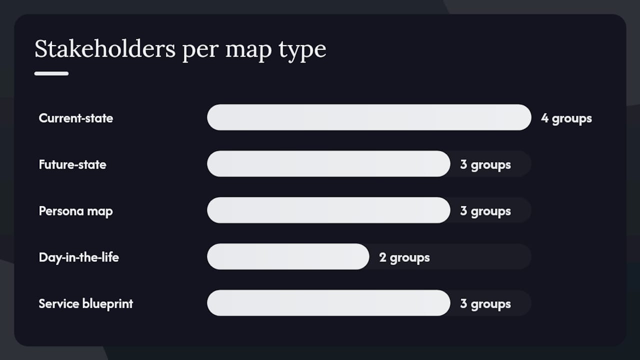
Zendesk’s guide to journey maps reinforces that current-state and future-state maps are the most widely used starting points, with current-state being the natural first step for any discovery exercise.
The practical recommendation: start with a current-state persona map. It grounds the team in evidence, surfaces the most urgent problems, and creates a shared baseline. Once you have that, a future-state map lets you design the experience you want to deliver. Service blueprints come later, when you are ready to operationalise the redesign.
This is a repeatable process you can run as a focused sprint. Salesforce’s complete guide and Harvard Business School Online both outline comparable step sequences; the version below integrates both with UK-specific governance practice.
Define your objective and scope. What decision will this map inform? Which customer segment and which part of the journey? A map without a clear objective produces a beautiful artefact that nobody uses.
Identify your persona(s). Use existing segmentation data, sales profiles, or CRM records. For B2B, map multiple stakeholder personas (end user, budget holder, procurement) and include an approvals lane.
Collect research. Mix qualitative and quantitative sources. Your research checklist: web analytics, voice-of-customer interviews, customer support tickets, usability testing recordings, sales team feedback, NPS/CSAT verbatims, and qualitative diary studies where depth matters. Do not skip the qualitative layer; numbers tell you where the problem is, interviews tell you why.
Map stages and touchpoints. Draft the stages first, then list every touchpoint within each stage. Include digital, human, and physical channels.
Document emotions and pain points. For each touchpoint, record how the customer feels and where friction occurs. Plot the emotion curve.
Locate voting points. These are the moments where the customer makes a go/no-go decision: opening a proposal, completing a registration form, receiving a first invoice. Mark them clearly. Designed interventions at voting points deliver disproportionate retention gains.
Ideate improvements. For each pain point and voting point, generate potential fixes. Keep this generative, not evaluative, at this stage.
Prioritise using an impact vs effort matrix. Plot each improvement on a two-axis grid. Focus first on high-impact, low-effort fixes at voting points.
Create a rollout plan. Assign owners, timelines, and success metrics to each prioritised improvement.
Monitor and iterate. Set a review cadence. The map is a living document, not a one-off deliverable.
Pro Tip: When you reach step 6, resist the urge to mark every touchpoint as a voting point. A genuine voting point is where the customer’s commitment to continuing is genuinely at risk. In most journeys, there are three to five of these. Concentrate your improvement effort there first and you will see retention results faster than if you spread effort evenly across all touchpoints.
For integrating this workflow with your B2B digital strategy, the research phase is where analytics and journey mapping connect most directly.
The table below shows a single-row template followed by a worked e-commerce example. Copy the column structure and fill it in for each stage of your journey.
| Stage | Persona | Touchpoints | Customer actions | Emotions | Pain points | KPIs | Owner | Next action |
|---|---|---|---|---|---|---|---|---|
| [Stage name] | [Who] | [Channels/contacts] | [What they do] | [How they feel] | [Friction/gaps] | [Metric] | [Team] | [Fix/test] |
| Consideration | Sarah, online shopper | Product page, review sites, comparison search | Reads reviews, compares delivery options, checks returns policy | Cautious, price-sensitive | Returns policy buried in footer; no size guide | Page-to-cart conversion rate | E-commerce team | Add returns policy summary above the fold; create size guide |
The emotion at the consideration stage for Sarah is cautious. That single word, placed in context, tells the e-commerce team that reassurance copy matters more than promotional copy at this point. The pain point (buried returns policy) is a five-minute fix with a measurable impact on conversion.
Adapting for B2B: replace the single consumer persona with two or three stakeholder personas (champion, budget holder, procurement). Add an approvals lane as a separate row beneath the main journey. Map the internal handoffs and procurement checkpoints as explicit touchpoints, because that is where B2B journeys most often stall. B2Bea’s guidance on B2B journey mapping makes the point clearly: in complex B2B contexts, the priority is making the customer’s job faster, easier, and more predictable, not adding delight.
Adapting for public sector: replace commercial KPIs with completion rates, error rates, and time-to-outcome. Map the citizen’s experience across channels (online, phone, in-person) and note where channel-switching creates friction.
For post-purchase retention touchpoints in e-commerce, email automation flows are among the highest-leverage interventions the map will surface.
KPIs to track by stage:
Measure NPS and CSAT specifically at voting points rather than as a single end-of-journey score. A customer who rates you 8 overall but had a terrible onboarding experience is a churn risk your aggregate score will not reveal.
Typical timelines:
Duration increases with the number of personas, the complexity of the research programme, and the degree of stakeholder alignment required. Integrating the map with live analytics platforms adds time but significantly improves the quality of prioritisation.
Cost drivers: research intensity (number of interviews, usability sessions, diary studies), number of personas, workshop facilitation requirements, and whether the output feeds directly into a service redesign or technology programme.
Most journey maps fail not in the making but in the aftermath. They are presented, admired, and filed. These are the patterns that cause it.
Common pitfalls:
Governance checklist to keep maps live:
Cross-functional workshops at the mapping stage reduce bias and build the shared ownership that makes governance sustainable. When the ops team helped build the map, they are far more likely to act on what it shows.
The right tool depends on your team size, collaboration needs, and whether you need analytics integration.
Template and visual canvas tools: Miro and Mural are the most widely used collaborative whiteboard platforms for journey mapping workshops. Both offer pre-built journey map templates and work well for distributed teams. Smaply is purpose-built for journey mapping and service blueprinting, with structured persona and journey layers. FigJam suits teams already working in Figma.
Research and analytics connectors: Google Analytics 4 provides the quantitative layer for digital touchpoints. Hotjar and Microsoft Clarity add session recordings and heatmaps that reveal friction at specific touchpoints. Qualtrics and Medallia handle VOC surveys and NPS at scale.
Low-budget options: A well-structured Google Sheets or Notion template covers the basics for smaller teams. Miles Marketing’s small business guide provides a plain-language template that works without specialist software.
Selection criteria: prioritise collaboration features if your team is distributed, analytics integration if you want to validate findings quantitatively, and export formats if the map needs to feed into a board presentation or procurement document. For teams evaluating process mapping software more broadly, the same criteria apply.
Pro Tip: Start with a shared whiteboard and sticky notes, physical or digital. The conversation that happens during a mapping workshop is often more valuable than the artefact it produces. Invest in facilitation before you invest in software.
The commercial case for journey mapping in B2B and complex organisations is not theoretical. Research in the Journal of the Academy of Marketing Science establishes journey mapping as a value driver that aligns internal interfaces across organisations and fosters repeat business by smoothing touchpoint transitions. For digital initiatives specifically, B2Bea’s analysis makes the risk of skipping mapping explicit: digitisation or CRM personalisation without a prior mapping exercise is, in their framing, guessing.
A professional services firm running a B2B subscription model mapped its renewal journey and found that most churn was not driven by product dissatisfaction. The voting point was the renewal notification email, which arrived with insufficient notice and no clear summary of value delivered. A revised email sequence with a 60-day lead time and a usage summary reduced churn at renewal. The fix cost almost nothing; the map made it visible.
For public-sector teams, the UK Government Communication Service treats the map as a living tool and recommends defining scope and objectives first to avoid unfocused outputs. That discipline, scope before detail, is what separates maps that drive change from maps that decorate walls.
Sprint-oriented recommendation for professional services: run a two-to-four week discovery sprint to produce a validated current-state map with three to five prioritised voting points. Use that as the brief for a prototype intervention. Measure the result before committing to a full redesign. This approach keeps investment proportionate to evidence and builds internal confidence in the method.
Pro Tip: When presenting map findings to senior stakeholders, lead with the voting points and their associated KPIs, not the full map. A board or leadership team needs to see where customers are at risk of leaving and what it will cost to fix it. The full map is the evidence behind that conversation, not the conversation itself.
Viaductgen’s AI-native approach to client work means the research phase of a mapping engagement runs faster and deeper than a traditional consultancy can manage. Proprietary AI infrastructure processes analytics, support ticket data, and VOC inputs simultaneously, so the discovery sprint surfaces patterns that would take weeks to find manually.
A typical engagement runs as a 90-day sprint with defined deliverables: a validated current-state journey map, a prioritised improvement roadmap tied to commercial KPIs, and a pilot implementation with measurement built in from day one. Senior strategists are involved in the work itself, not just the oversight. The growth and strategy planning service connects map findings directly to a commercial roadmap, so the output does not sit in a folder.
If your team is ready to move from theory to a mapped, prioritised, and piloted improvement programme, request a discovery call to scope the engagement.
A customer journey map is a visual document that shows the experience a customer has with your organisation from their perspective, capturing what they do, think, and feel at each stage from first awareness through to advocacy.
The core steps are: define your objective and scope; identify your persona; collect qualitative and quantitative research; map stages and touchpoints; document emotions and pain points; locate voting points; ideate and prioritise improvements; create a rollout plan; then monitor and iterate. Salesforce’s guide outlines a comparable sequence in practical detail.
Most journey frameworks cover five to six stages: discovery, consideration, decision, fulfilment, retention, and advocacy. The right number depends on your customer’s actual experience, not a standard template.
Start by defining a clear objective, then choose one persona and one journey segment. Gather research from analytics, customer interviews, and support data. Draft the stages, map touchpoints within each, plot the emotion curve, and mark voting points. Prioritise fixes using an impact vs effort matrix before moving to implementation.
A journey map shows the customer’s experience from their perspective. A service blueprint extends this by adding the backstage processes, systems, and staff actions that enable or obstruct that experience. Use a journey map to diagnose problems; use a service blueprint when you are ready to redesign the service end-to-end.

